E-COMMERCE
Increased Marketplace Conversion rate by 1.5x
CLIENT
MD Py
YEAR
2023
IN SHORT
I partnered with a small marketplace startup to improve the overall conversion rate on both desktop and mobile platforms. I led the design process from identifying root causes and ideation to defining, testing solutions, and overseeing hand-off and implementation.
IMPACT
40% increase in overall conversion rate
36% decrease in churn rate on checkout flow
9% increase in mobile conversion
CLIENT
Mercado Digital is a small marketplace from Paraguay that is gaining recognition among established and long-standing marketplaces.
TEAM
1 Product manager, 2 developers,
Me as Principal Designer
Understanding
Finding Quantitative Data & metrics
I conducted a funnel analysis to identify primary drop-off points. Comparing these results with industry standards revealed Mercado Digital's performance gap and highlighted areas for improvement.
The overall conversion rate was significantly below the industry benchmark.
Major drop-off points occurred at the product page and checkout page.
The drop-off rate on mobile devices was 40% higher compared to other platforms.

AUDITING
Run a Design Audit to spot opportunities for improvement and formulated hypothesis for improvement
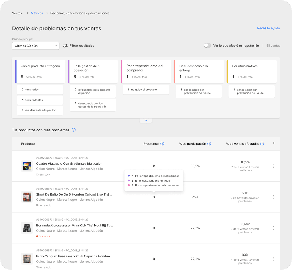
Product Page
The product page lacked crucial information, had a poor hierarchy, and faced interaction issues. These problems created a confusing experience, making it hard for users to make informed decisions and proceed through the purchase flow.

1
Unbalanced layout lacking clear hierarchies
2
Confusing color scheme creates visual clutter
3
Difficult to distinguish interactive from informational
4
Missing trust badges
5
Missing critical item details for decision making
Checkout flow
The checkout process was hindered by missing security badges and inconsistent user flows. It featured overcrowded, overcomplicated forms, unclear sections and steps, and ambiguous error messages.


Competing steps make the process overwhelming
Confirmation step is unclear
Competing CTAs obstruct the main action of the screen
Inconsistent layout across screens
1
Cluttered and inconsistent layout across screens
2
Undefined sections and steps
3
Competing CTAs obstruct the main action of the screen
4
Disabled CTAs and unclear errors hinders advancement.
PROBLEM DEFINITION
Potential buyers arriving at MDs site often become discouraged despite finding what they were looking for. This is primarily due to unfamiliar user flows, inadequate trust signals, and the additional effort required to navigate and make informed decisions. A poor user experience diminishes trust in the site, leading to uncertainty and hesitation among users.
How might we simplify the purchase process to reduce cognitive effort and boost decision-making confidence?
GOAL
Enhance the user experience on the MDs Product and Checkout pages by simplifying user flows, reducing cognitive overload and improving trust signals.
1
Reduce cognitive overload
2
Simplify selection flow
3
Streamline user flow
3
Build trust with a clean UI and trust badges.
DESIGN INTERVENTIONS
Using the defined goals, I established a framework for measuring success, explored potential solutions, and proposed effective design interventions.

Wireframing and validating
CHALLENGE 1
High conversion Product Page
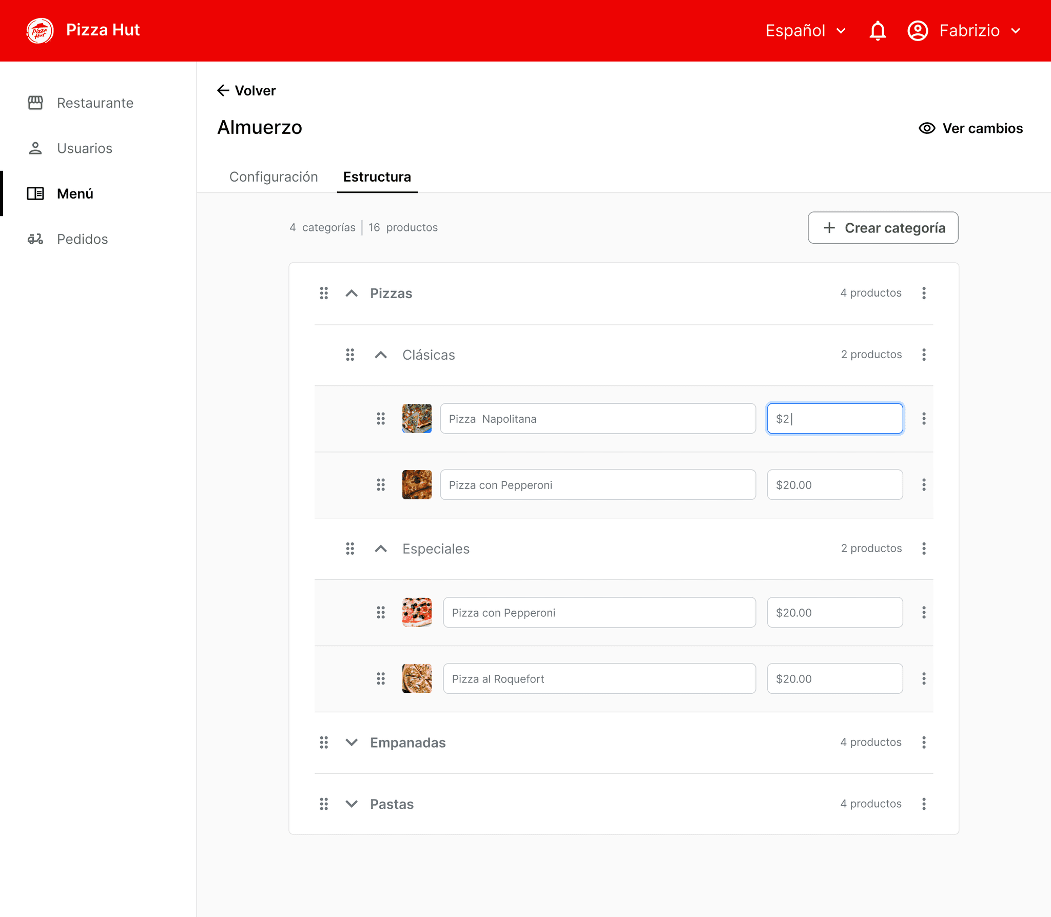
Finding the best performing layout. For the product page, I suggested testing multiple combinations to identify the highest converting alternative. To facilitate this, I created a multivariable sheet with variations in information clustering and order, primary and secondary information placement, hierarchies, position of price, and CTAs.


A
B
C
Enhance clarity by establishing clear sections and hierarchies, grouping related information, using clear CTAs and color coding, and providing better images and detailed descriptions.

1
2
3
4
5
6

Before
After
1
Detailed item information for decision making
2
Easily recognizable buttons with clear affordances
3
Thumbnails for close inspection
4
Price emphasized + effective color use for secondary info
5
Clear CTAs with strong visibility & contrast
6
Clear and prominent security signals
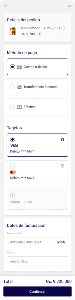
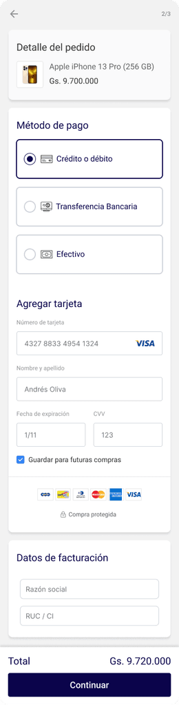
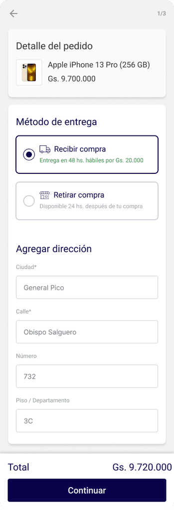
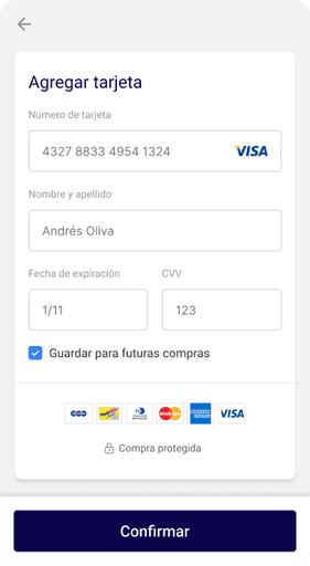
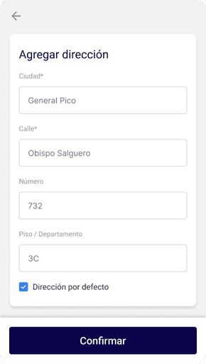
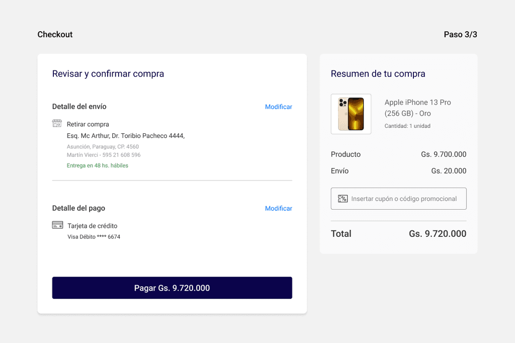
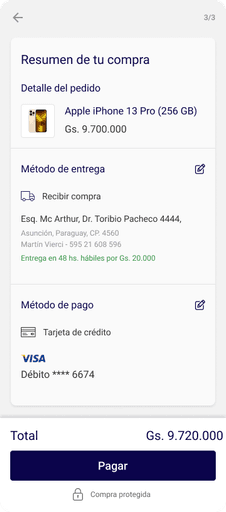
CHALLENGE 2
Streamline Checkout flow
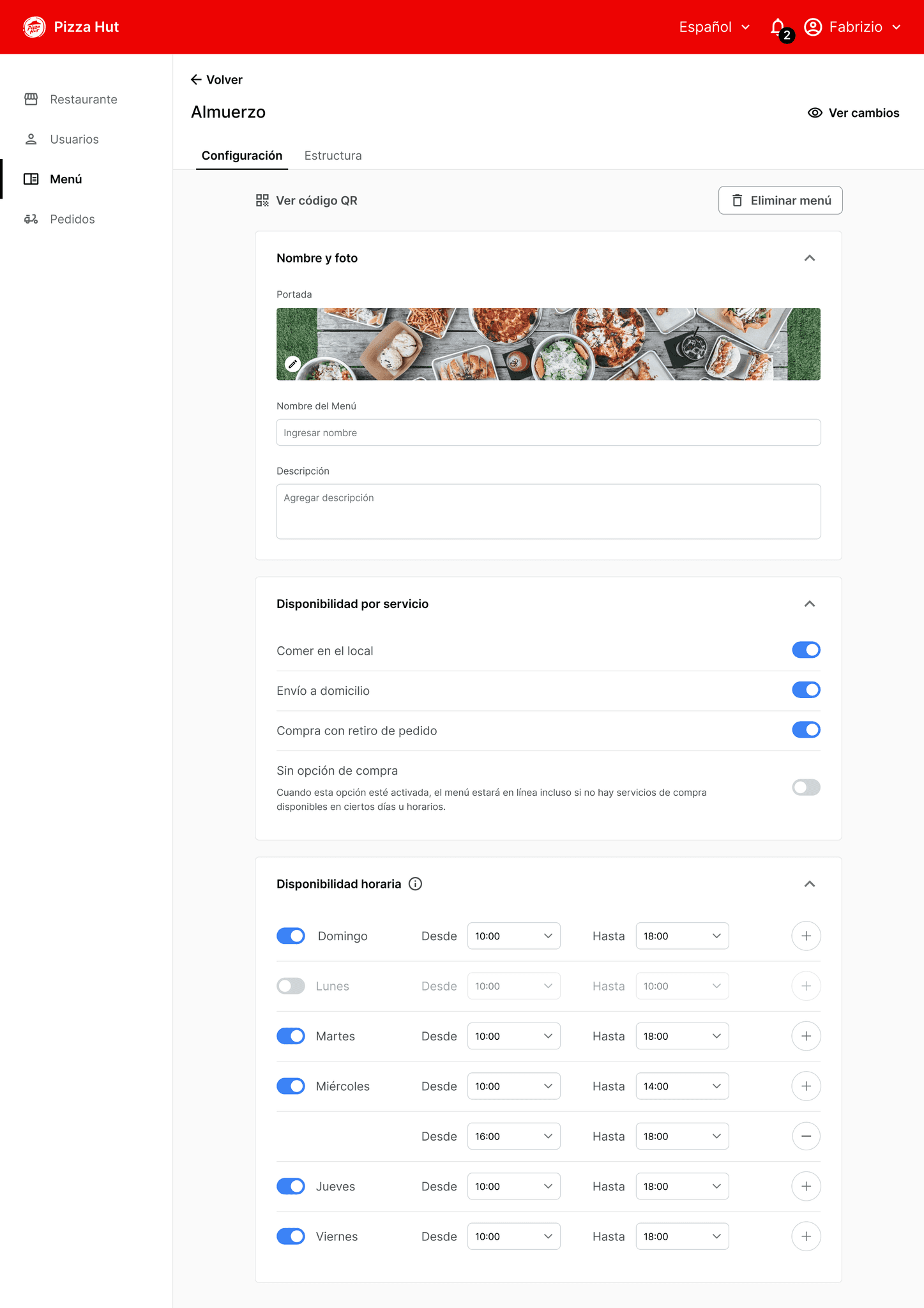
For the checkout, we focused on streamlining the flow by A/B testing specific variants to validate hypotheses: single-page vs. multi-step checkout, placement and presence of security badges, size and copy of the main CTA, and guest checkout vs. account creation.


B
A
For the checkout, we focused on streamlining the flow by A/B testing specific variants to validate hypotheses: single-page vs. multi-step checkout, placement and presence of security badges, size and copy of the main CTA, and guest checkout vs. account creation.


Before
After
1
Step-by-step flow with progress indicator
2
Clear titles for section separation
3
Clear selection components with critical information
4
Prominent CTA to signal the primary action
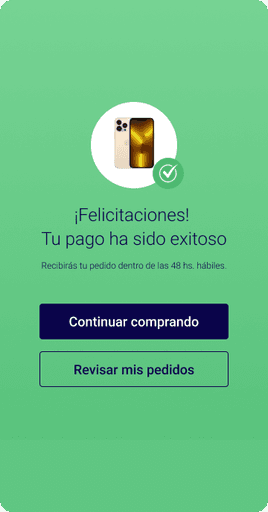
ACHIEVEMENTS
The new design led to:
A 40% increase in overall conversion rate
A 36% reduction in churn rates at checkout
A 9% increase in mobile conversion
A significant revenue boost for a small marketplace with 1,500 daily visits
KEY LEARNINGS
This project taught me to manage limited resources while asserting my role as the principal designer. At a small startup without a design vision, I provided thorough assessments and guidance throughout the product iteration. Strong communication, clear rationales, and gaining early confidence from platform builders were key to effective collaboration and a smooth workflow.
CHALLENGE 3
Optimized for mobile
AAA

E-COMMERCE
Streamlining Seller performance tracking with a centralized hub
B2B- FOOD INDUSTRY
Streamlining B2B Backoffice experience to boost efficiency
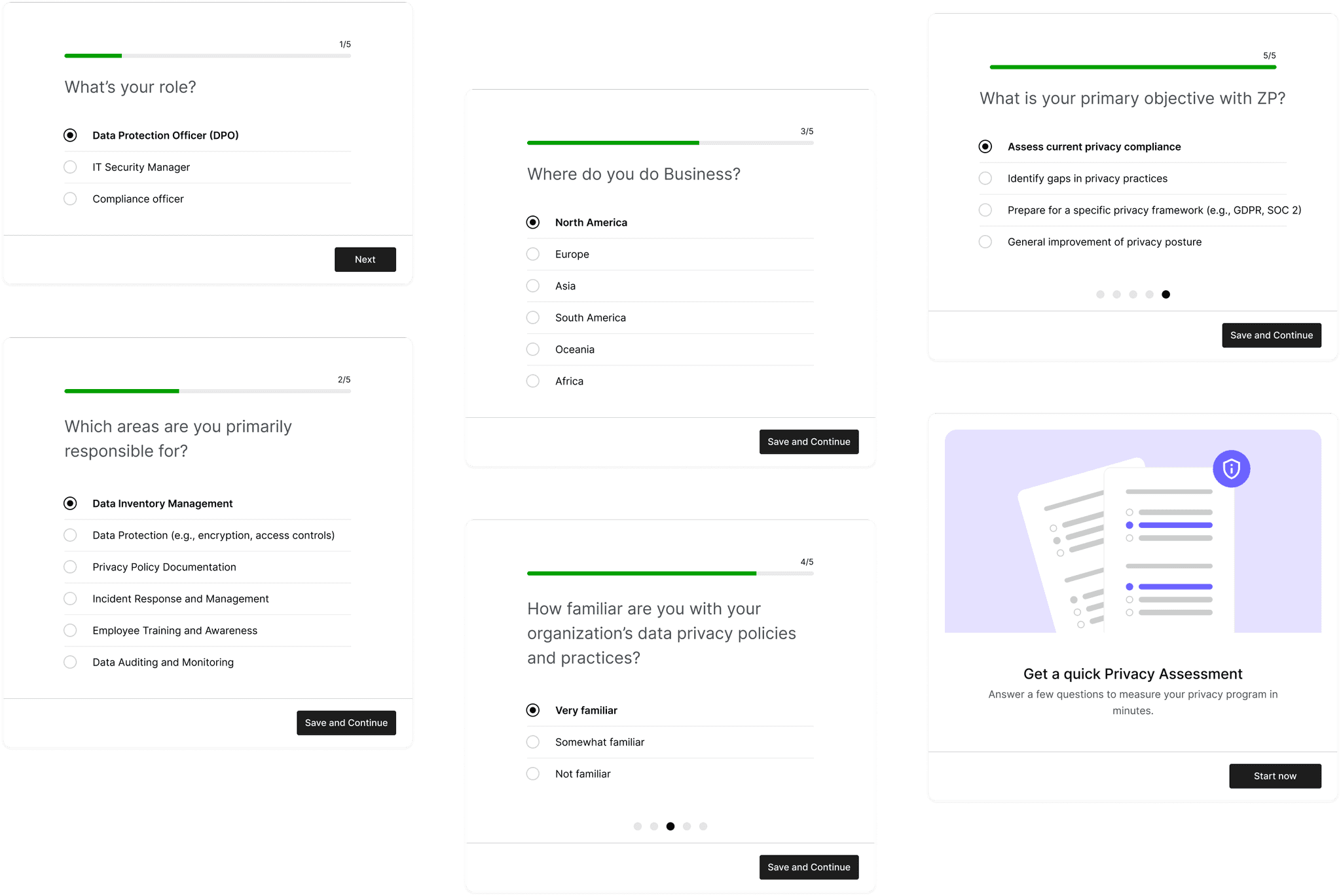
SAAS - DATA PRIVACY
Optimizing setup flow for higher activation rate
Thanks for watching
Let's get in touch:
PORTFOLIO | LEAN MORERA | 2024