E-COMMERCE
COMPANY
Mercado Libre
YEAR
2022
IN SHORT
Mercado Libre identified a need to improve Seller performance tracking, as existing third-party dashboards were costly, complex, and overloaded with irrelevant data. These platforms also suffered from poor user guidance and delays in real-time updates, making them less effective for small to mid-sized sellers.
Our team was tasked with designing a centralized metrics hub from scratch, aimed at becoming the go-to destination for non-integrated sellers and a superior alternative that focuses on delivering best-in-class user experience while addressing underserve needs.
As the principal designer, I led the entire process from research and defining the product vision to designing, validating across multiple sprints, managing handoffs, coordinating with teams, and securing buy-in from C-level management.
IMPACT
90% of target users adopted the dashboard within the first month.
87% of users expressed strong satisfaction, especially with the opportunity finding features.
Contact rates dropped by 65% due to improved understanding of reputation metrics.
TEAM
A small squad of 6 people. Team Leader, Principal Designer, Second Designer, Content writer, One developer and one Product analyst.
COMPANY
Mercado Libre is the largest online commerce and payments ecosystem in Latin America.


OPPORTUNITY
sync
Low Integration rate
Over than 50% of Midtail sellers and 90% of Longtail sellers were not integrated with third-party platforms, primarily due to high costs.
monitoring
Performance gap
Integrated sellers performed at least 10% higher in both sales and reputation compared to non-integrated sellers.
face
User dissatisfaction
For integrated sellers, 70% of dissatisfaction with third-party tools stemmed from high complexity and cost.
call
High contact rate
Frequent support queries from both integrated and non-integrated sellers due to misunderstandings around reputation metrics.
PRODUCT VISION
Develop a centralized metrics dashboard that provides cost-effective, user-friendly performance tracking for all seller segments. Aim to enhance seller performance and satisfaction, reduce support queries, and drive higher integration rates.
TARGET
Midtail Sellers
2143 Sellers | 33 % GMV | 50% integration
Longtail sellers
662.000 Sellers | 2 % GMV | 10% integration
Advised portfolio
464 Sellers - 17% GMV | 100% integration
GOALS
Increase adoption and satisfaction rates: Become the primary platform for performance tracking among small to mid-sized sellers.
Deliver an enhanced experience: Simplify data, streamline navigation, and address underserved and high-importance needs to stand out from the competition.
Reduce CX contact rate: Address confusion around metrics, particularly reputation tracking, to decrease contact rates.
Boost seller analytics proficiency: Provide relevant, real-time metrics that sellers can act upon to optimize their business.
OUTCOME ORIENTED STRATEGY
I collaborated with the Product Manager to develop an outcome-oriented framework that help guide the design process and keep focus on the pursue outcomes.

CORE UNKNOWNS
The first step was gathering the entire Metrics team to kick off the project and identify the key unknowns that would guide the understanding phase.
What approaches were sellers using to measure and improve performance?
What tools were they utilizing, and what motivated their use?
What challenges and underserved needs did they encounter in this process?

RESEARCH
We conducted generative research into sellers' routines, performance tracking methods, workflows, needs, and pain points. This involved:
Interviews: Engaging sellers across customer segments to capture diverse perspectives and minimize biases.
Surveys: Collecting quantitative data on sellers' experiences with performance metrics.
INITIAL FINDINGS
Sellers relied on the 80/20 Pareto rule, competitor actions, and customer feedback to answer two core questions: "What am I doing well?" and "Where can I improve?" However, they struggled to easily extract these insights from third-party dashboards due to information overload and poor navigation systems.
COMPETITORS LANDSCAPE
I also conducted a competitive analysis of third-party platforms mentioned by users in interviews to identify their strengths, weaknesses, and major usage drivers.
Third-party platforms primarily provided data-heavy dashboards focused on market and competitor analysis. However, they lacked metrics related to operational delivery and post-selling performance.
We identified 3 key underserved needs crucial for differentiation and driving adoption:
Post-Sale Insights: customer feedback data related to claims & returns, to help sellers refine their strategies and improve overall performance.
Delivery Performance: Offering critical metrics related to logistics and delivery to assist sellers in optimizing their operational processes.
User-Friendliness: Enhancing ease of use to ensure the dashboard is intuitive and accessible for all sellers.

FRAMING THE CHALLENGE
Sellers struggled with cluttered dashboards and poor navigation systems that didn't match their mental models, making data hard to use. They also found it challenging to systematically navigate customer feedback to identify issues and improvement opportunities.
How might we equip sellers with easy-to-navigate data that help them quickly identify strengths and areas for improvement?
THE HYPOTHESIS
By creating a free and centralized metrics dashboard that combines core business metrics with in-depth customer feedback, we can significantly improve sellers' experience in performance measurement, differentiate from competitors, and drive user acquisition.
IDEATING
We conducted an ideation session to explore initial ideas and prioritized them based on their potential to contribute effectively to our business goals.

Product definition
DESIGN PRINCIPLES
In order to maintain alignment and support unified decision-making, I developed principles based on key opportunities to ensure coherent design and effective reviews.
1
Actionable
Focus on key data for decision-making to minimize overload.
2
Insightful
Enable effective analysis aimed at identifying root causes.
3
Narrative-driven
Structure data to align with how users approach performance evaluation.

MVP DEFINITION
In order to define the MVP we used a Kano model to identify basic, performance, and delighters functionalities guiding our prioritization process
USER STORIES
Next, I conducted a user story mapping session to begin envisioning our metrics dashboard.
WIREFRAMING
I worked on low-fidelity proposals to begin defining the overall architecture, sets of metrics, and main user flows.

The final solution
After a thorough iterative process of wireframing, prototyping, and user validation, we completed the first version of MELI's new metrics section.
Given the project's broad impact on various business areas, the main challenge was advancing the design while incorporating diverse input and securing consensus.
To address this, I created a document to chronologically record decisions, pros/cons, and rationales, which streamlined our process and saved significant time.
CHALLENGE 1
The initial challenge was determining where the new metrics section should live and how it would fit into the overall story.
To create an information architecture that aligns with sellers' mental models, I conducted a card sorting study where participants grouped and labeled 24 metrics. This helped us identify category patterns to start building the architecture.
We then tested multiple alternatives to find the best version, evaluating:
Time to Find Specific Information: How quickly participants could locate metrics.
Task Success Rate: How successfully participants could find and understand key metrics.

CHALLENGE 2
Business overview
The Business subsection was designated as the starting point upon entering the 'Metrics' section, acting as a thermometer for the business to help sellers understand performance and identify strengths for focused attention.
To define this module, I tested various combinations of metrics, their order, display formats, and chart types to determine the most effective way to present business health.
The optimal combination was GMV, Sales Amount, Units Sold, and ASP.
Using a single line chart to display one metric at a time proved more effective than separate charts for each metric.


1
Comparison periods and filters for analysis granularity
2
Tabs and full-size charts to analyze one metric at a time
3
Top performers & key data to understand list position
4
Accesible guidelines to understand each metric
CHALLENGE 3
Top performing items
For the top performers ranking, the main challenge was providing enough data to explain why an item was ranked as it was.
I explored and tested multiple combinations of key metadata & KPIs to track:
Combinations of KPI Columns: The best-performing combination was Gross Sales, Percentage of Contribution to Overall GMV, and Units Sold.
Versions of Item Rows: Various designs were tested to identify the essential metadata needed to clarify each item's position.

1
Key metadata to explain item performance
2
Key metrics to assess overall performance
CHALLENGE 4
Customer experience metrics
The Customer Experience section aimed to identify problematic items and sales, addressing high CX contact rates due to misunderstandings. It aggregated user feedback to help sellers navigate from general issues to specific problems and take action.

One main challenge was to reframe the Post-Selling problems tree for Buyers into an opportunity-focused tree for Sellers. To address this, I broke down the Buyers' issues into individual types and conducted a card sorting exercise with Sellers to rebuild it based on their mental models.

1
Aggregated user feedback into a ranking chart
2
Reputation filter to identify most influential issues
3
Key metrics for measuring customer service quality
4
Disaggregation to understand metric composition
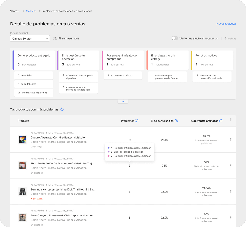
CHALLENGE 5
Deep dive into customer feedback
The Problems section aimed to identify issues leading to claims, cancellations, and returns.
One of the main challenges was creating a navigation system that ranks problems by category and item while allowing interaction between both analyses.
After several iterations and tests, we arrived at a navigation component that lets users analyze issues with varying granularity. It includes a filter board for selecting problem levels and switching between item and sales views.
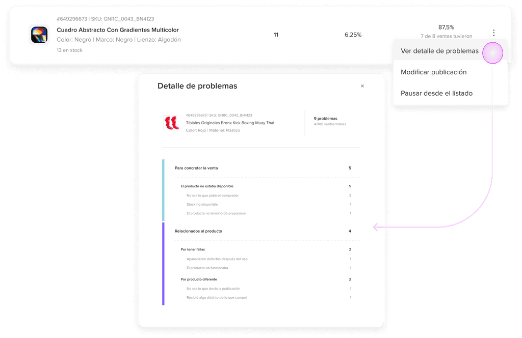
1
Expandable cards rank problem and act as filters.
2
Ranking of problematic items/sales filtered by type.
3
Problems detail aggregated by item or sale ID.
4
Disaggregation of problems at the item level.
CHALLENGE 6
Delivery metrics
The Delivery performance section aimed to help sellers identify instances and timings of delayed shipments.Since the root causes of delays can be complex and indirect, we focused on symptoms and aggregated data to uncover potential issues.
To develop metrics for pattern recognition and help sellers trace root issues, we conducted interviews to identify common delivery causes. I then created a chart linking these causes to signals revealing underlying problems.


1
Delays over time by service type to identify problematic and high-volume periods
2
Total delays, disaggregated by service type, to identify the most problematic delivery service
3
Heatmap of weekly delay concentration to identify bottlenecks and demand peaks
4
Pareto ranking items by delay contribution to identify stock or logistics issues
CHALLENGE 7
Contextual help and guidance
A key aspect of the project was designing contextual guidance, such as tooltips, inline help, and links to educational sections.
To address this challenge, I collaborated closely with UX writers to develop the right help components and guidelines. We tested multiple versions for each metric to ensure users could fully understand and use the dashboard. Effective guidance was key to reducing contact rates due to misunderstandings about reputation metrics.


CHALLENGE 8
Onboarding
Finally, we designed a comprehensive onboarding experience with guided tours and educational material to ensure users could navigate the dashboard with complete autonomy.


ACHIEVEMENTS
Adoption & retention: 90% of target users adopted the dashboard within the first month, with sellers logging in an average of 3.5 times per week.
Seller satisfaction: 87% of users expressed strong satisfaction with the dashboard, particularly valuing the problem-solving features.
Support queries: Decreased by 65%, showing improved understanding.
KEY LEARNINGS
This project taught me valuable lessons in managing complexity and navigating the multiple impacts across a platform with extensive cross-dependencies. Collaborating with cross-functional teams underscored the importance of teamwork and securing stakeholder buy-in. I learned the value of documenting decisions to foster transparency and using iterative feedback loops for continuous improvement.
B2B- FOOD INDUSTRY
Streamlining B2B Backoffice experience to boost efficiency
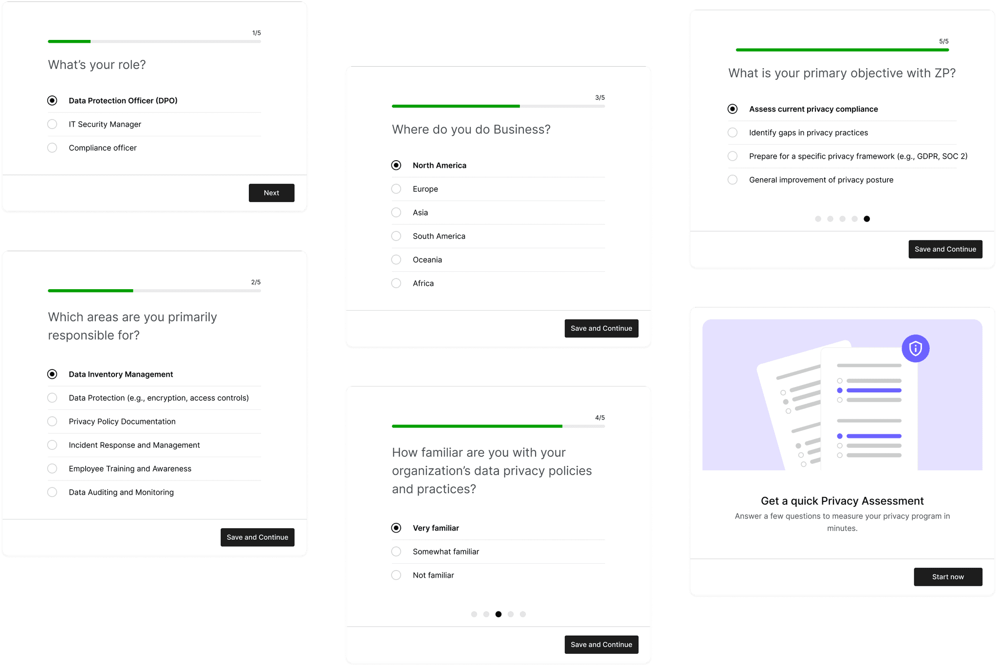
SAAS - DATA PRIVACY
Optimizing setup flow for higher activation rate
E-COMMERCE
Enhancing Marketplace Conversion rate by 1.5x