DATA PRIVACY
CLIENT
Zen Privata
YEAR
2024

IN SHORT
I partnered with Zen Privata's team to identify core issues driving low activation and poor engagement, ideate and define potential solutions, and test design improvements.
IMPACT
Increased activation rates by 40% and significantly decreased early drop-off rates.
TEAM
CEO, 1 Product manager, 1 tech lead, 3 developers, Me as Principal Designer
CLIENT
Zen Privata
ANALYTICS ASSESSMENT
We examined the numbers, and here's what they revealed:
Less than 15% of users completed the onboarding video.
The main drop-off point was at the Privacy Questionnaire.
Less than 20% of those who started the questionnaire reached the third page.

DESIGN AUDIT
First, I performed a design audit to identify key issues causing frustration, leading to disengagement and low activation rates.
No autosave option > risk of miss changes

Cluttered UI with unclear descriptions and no introduction creates confusion.
1
Cumbersome questionnaire due to a chaotic UI
2
Ambiguos choices delay responses
3
Confusing dashboard fails to deliver on its promise
4
Poor guidance across the entire journey
RESEARCH
Next, I conducted four one-on-one interviews to gain deeper insights into the pain points hindering activation. Here are the core findings:
FRAMING THE CHALLENGE
Target users are drawn to ZP's value but, upon entering the platform, face unclear guidance and find the privacy assessment questionnaire cumbersome, time-consuming, and often irrelevant, with no clear incentives to continue. This prevents them from seeing the benefits and causes them to leave early.
How might we reduce "time to value" for target users while offering clear guidance on purpose and direction, without exhausting their energy?
DESIGN PRINCIPLES
I proposed creating design principles collaboratively to guide the solution process and ensure the team aligns with the product’s goals and user needs.
1
Embedded value proposition
Clustering set of metrics under sections that follow users mental models and approaches for performance tracking
2
Focus on clarity & relevance
Trigger to explore new features/capabilities as the user gets familiar with the platform
3
Small steps that build momentum Focus on key information first to reduce overload and drive greater impact with less effort.
IDEATION
I led an ideation session with the entire team to address the main challenges. I proposed using the Opportunity Solution Tree framework to trace ideas back to the identified opportunities and desired outcomes, allowing us to evaluate and prioritize based on potential impact.

DESIGN INTERVENTIONS
We focused on the ideas with the greatest potential to address the business goals and translated them into concrete design interventions.
THE HYPOTHESIS
A streamlined questionnaire and straightforward user flow, combined with an engagement loop that prompts users to make incremental progress and recognize the tool's value, can increase the activation rate.
OUTCOME ORIENTED STRATEGY
I came up with an Outcome-oriented framework to guide the process and measure success along the way.

ENGAGEMENT STRATEGY
Ideating on potential engagement strategies to nudge users to complete questionnaire progressively and provide further information as they perceive value from ZP.

ACTIVATION FLOW
Ideating alternatives to simplify the first-time use flow and guide users toward activation.

Final interventions
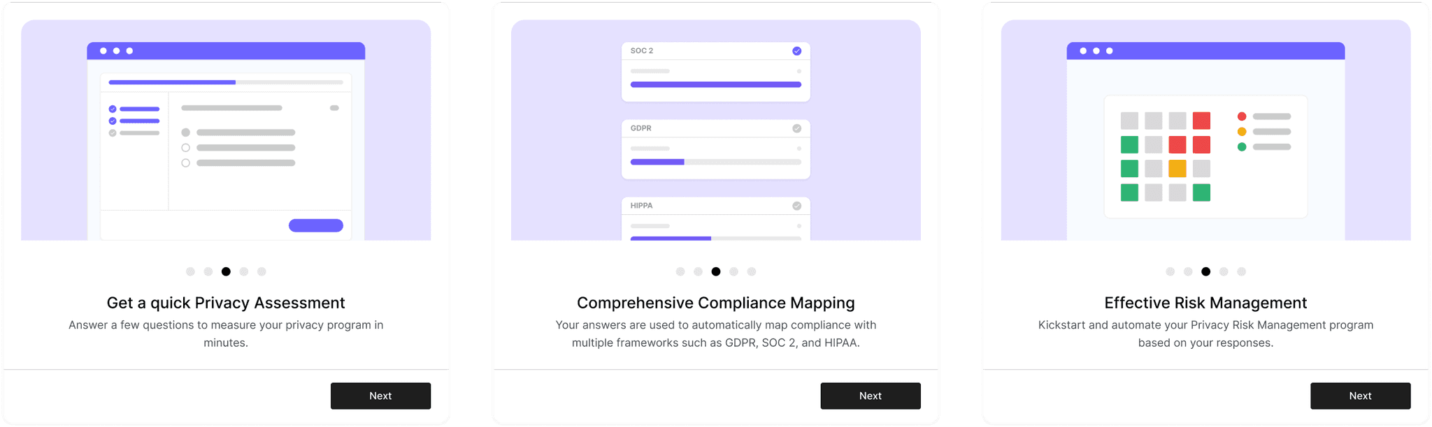
CHALLENGE 1
Streamlined onboarding
The onboarding had to fulfil 2 main goals:
1
Smoothly understand the value of the product,
2
Set expectations about next steps to follow.
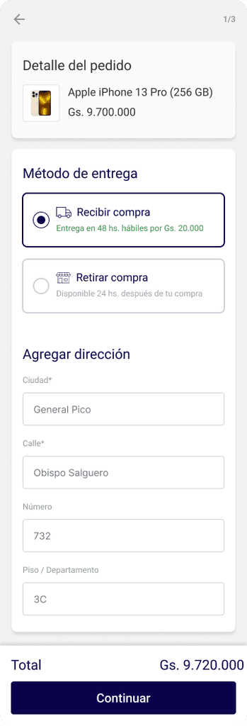
To set expectations for the next steps, I designed a setup checklist and tested various user flow alternatives to identify the clearest option that leads to higher conversion rates for starting the questionnaire. The goal: determine the most effective onboarding flow to maximize conversion rates for starting the questionnaire by evaluating clarity, ease of navigation, and user engagement.
A) Step-by-step approach
B) Simplified flow with combined setup steps:
C) Concise flow

The best performing user flow was the A: It excelled with the highest conversion rate, effective user engagement, and minimal drop-off. Its detailed, step-by-step approach clearly conveyed the value proposition and received positive feedback.
CHALLENGE 2
Intake Questionnaire
The intake questionnaire was designed to filter and tailor the privacy questionnaire to each respondent's profile, ensuring relevance and minimizing unanswered questions.
By mapping variables like role and geography, we developed a matrix that dynamically adjusts the questionnaire based on the intake responses.
Through this approach, we reduced the original 25 questions to the top 15-20 most relevant for each use case, making the questionnaire both comprehensive and efficient.
CHALLENGE 3
Simplified privacy questionnaire
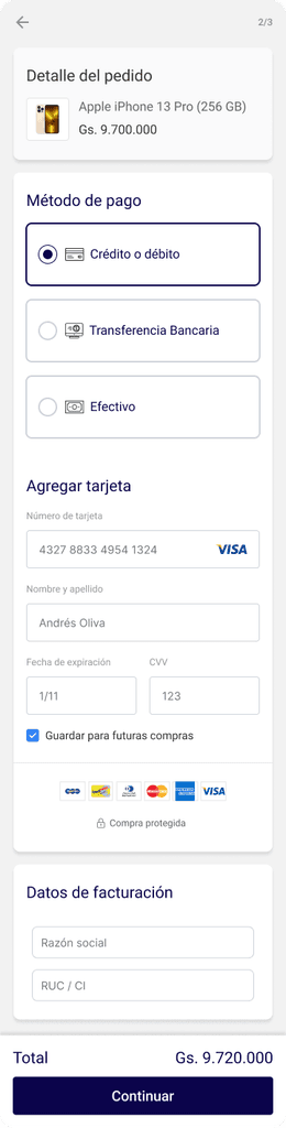
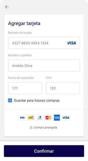
To improve the privacy questionnaire, I proposed focusing on two key areas: reframing questions as Yes/No options and streamlining the UI to eliminate friction and distractions.
1
Convert to Y/N for quickstart
2
Simplifying UI and allow progress tracking
Introduce Y/N questionnaire
The challenge was to minimize ambiguity by using precise language that left no room for confusion. To achieve this, I developed a set of writing principles based on the questions that caused the most ambiguity.
Following these guidelines, we reframed questions to be clear and answerable with a simple "Yes" or "No," eliminating ambiguous options like "Partial" or "Mature" that delayed the answering process. This reduced hesitation and ensured more accurate responses.
Simplify UI
I designed a dedicated page for the questionnaire with a streamlined UI that minimizes distractions and ambiguity, featuring clear CTAs to guide users forward.
The strategy was to emphasize progress over perfection, encouraging users to complete sections now and revisit remaining questions later to build momentum.
Before
After
1
Remove unnecessary explanations and irrelevant CTAs
2
Clear progress tracking to set expectations
3
Eliminate text fields and enable postponing questions
4
Clear, unified CTA with built-in autosave
CHALLENGE 4
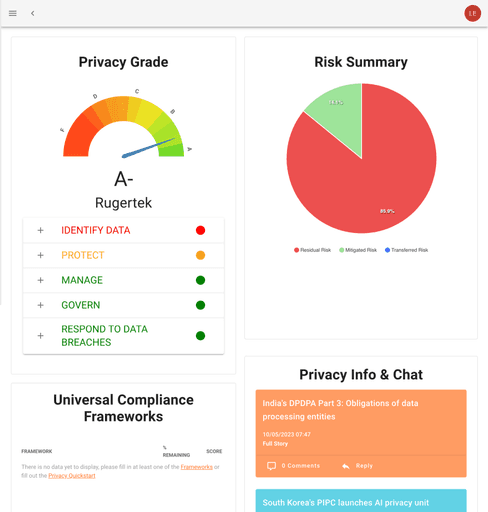
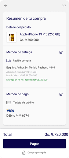
Enhanced dashboard clarity
After completing the Quickstart Yes/No questionnaire, users received a celebratory message and were directed to the dashboard, where they expected to see the promised value: an assessment of their privacy program.
I simplified the layout, made each module self-explanatory, and aligned it with the initial value promise. This ensured users understood how their answers populated the dashboard and the content of each module.
1
Deliver on the promised value proposition
2
Streamlined layout with clear CTAs for further exploration

Before
After
1
Clear scoring with detailed maturity levels
2
Actionable improvement recommendations
3
Progress indicators to track compliance
4
Clear CTAs to explore each module in depth
CHALLENGE 5
Nudge for further completion
Finally, to incentivize completion, I proposed experimenting with gamification strategies, focusing on two main goals: providing clear progress feedback and offering explicit incentives to encourage users to complete their privacy program assessment.
1
Showing progress made upfront
2
Nailing best performing messages and incentives

1
Prominent questionnaire progress tracker component
2
Achievement badges for questionnaire stages
3
Clear progress bars to track completion
4
Persuasive incentives to motivate completion
I explored different banner alternatives to identify which best supported the strategy of nudging users through trigger messages, clear actions, and showing rewards after task completion. I focused on two use cases and designed prompts for each:
A) Incomplete Privacy Questionnaire > Prompt to finish
B) Completed Quickstart Privacy Questionnaire > Prompt to assess maturity level
We ran experiments and found that while badges effectively defined a clear roadmap for improvement, they weren’t sufficient to encourage completion. Concrete incentives performed better, such as: Unlocking an improvement roadmap; Downloading and sharing the full report; Accessing an industry benchmark for comparison; Getting a free consultation.
Preliminary results
Users who received prompts to "Unlock your personalized improvement roadmap" or "Download your detailed privacy report" were 40% more likely to complete the questionnaire compared to those who only saw progress badges.
Users prompted with the incentive to "Get an industry benchmark for comparison" or "Receive a free consultation" showed a 50% increase in engagement with the maturity assessment, compared to those who received generic prompts.
ACHIEVEMENTS
Improved activation rate by 40%
Significantly decreased early drop-off rates.
Significantly improved engagement rates for new users
Influenced the product's improvement roadmap, shifting from output-focused to outcome-oriented.
KEY LEARNINGS
This project challenged me to quickly immerse myself in the unfamiliar field of data privacy, gain a deep understanding, and drive impact.
I gained confidence in guiding processes in new domains by educating a design-agnostic team on the importance of UX and strategy, helping to build a strong product vision. I effectively aligned the team on key areas for improvement and shifted the focus from merely fulfilling the roadmap to understanding what wasn’t working and why.
E-COMMERCE
Enhancing Marketplace Conversion rate by 1.5x
E-COMMERCE
Streamlining Seller performance tracking with a centralized hub
B2B- FOOD INDUSTRY
Streamlining B2B Backoffice experience to boost efficiency
Thanks for watching
Let's get in touch:
PORTFOLIO | LEAN MORERA | 2024