E-COMMERCE
Streamlining B2B Backoffice experience to boost efficiency
CLIENT
Menu Factory
YEAR
2023
IN SHORT
As an early startup, Menu Factory’s initial focus on enhancing the front-end experience for end customers left the back office neglected.
While ready-made menu setups for new subscribers eased onboarding, restaurant admins struggled with a steep learning curve and multiple issues when managing menus on their own due to the complex, unintuitive interface. This led to high support requests and underscored the need for a redesign.
I partnered with Menu Factory's team to lead the redesign of the menu creation and management process from the ground up, covering opportunity mapping, competitor research, ideation, design, and hand-off documentation.
*This project is part of a series of design improvements in a comprehensive roadmap aimed at elevating the overall platform experience for both customers and restaurants.
IMPACT
Enhanced Efficiency: The redesigned, intuitive interface significantly reduced time and effort for menu management.
Reduced Support Requests: The intuitive interface significantly decreased the volume of support requests, saving time and resources.
Increased User Satisfaction: Both new and existing customers expressed high satisfaction with the revamped back office experience.
CLIENT
Menu Factory is an early startup offering a two-sided platform that helps restaurant owners and managers efficiently build and manage their digital menu experience, while also enhancing the dining experience for customers.
TEAM
CEO & founder, 1 Product manager, 2 developers, Me as Principal Designer
RESEARCH
I conducted evaluation research with 5 participants, including current users and newcomers, to identify key pain points affecting the user experience.
Participants were asked to complete tasks such as creating and editing menus, and arranging menu structure. I measured task efficiency using metrics like time on task, error rate, success rate, satisfaction score, and understanding.
Findings
Success Rate: 50% successfully completed tasks without aditional help.
Error Rate: High errors in item addition and arrangement.
Time on Task: Users took 20% longer than expected.
Satisfaction Score: Average rating of 3/5, with user frustration reported.
Understanding: 70% of users found the interface overwhelming and unclear.
DESIGN AUDIT
Then, I conducted a design audit to identify key issues causing user dissatisfaction and to establish a roadmap for improvements
Menu setup & editing
The menu setup and editing flow suffer from architectural, content, and interaction issues, overwhelming new users. The UI appears chaotic, with no clear order or actions to follow.
No access to full catalog of products
Unclear impact of CTAs on the overall menu.
Buttons lack clear affordances

Irrelevant currency type selection step in the current flow
Irrelevant language selection step in the current flow
Cluttered layout with no clear hierarchies
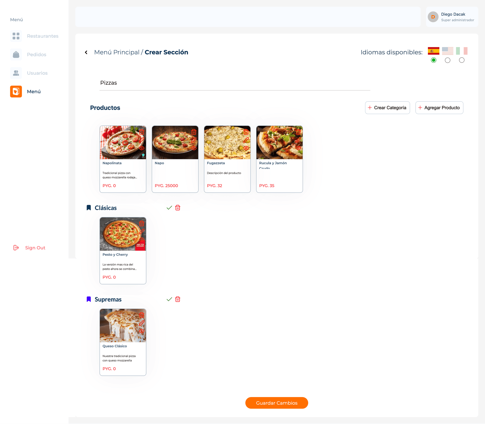
Menu arrangement separated across two screens.
Missing key config options: open hours and service type.
No autosave option risks losing changes
Menu arrangement separated across two screens.
1
Cluttered layout with poor hierarchy, & inconsistent CTAs
2
Menu arrangement separated across two screens
3
Unable to access to full catalog of products
4
Missing key config options
Item creation
The item creation flow was isolated on a separate screen, requiring back-and-forth navigation for unaddressed use cases, like quickly scanning menus to edit item details. This screen also struggled with poor hierarchy, competing elements, and inconvenient design patterns, which hindered focus and direction.

Overwhelming layout with no clear sections or order.
Dropdown pattern doesn’t scale for multiple selections.
Nested item creation screen disrupts flow.
1
Overwhelming layout with no clear sections or order.
2
Separated item creation screen disrupts flow.
3
Inconvenient use of design patterns.
DEFINING THE PROBLEM
The interface is overly complex and unintuitive, causing frustration and inefficiency.
Setting up the menu, editing it and creating items are mixed under the umbrella of a unique set up flow. Nonetheless, they belong to different moments in the user flow.
Arranging the menu structure becomes hard and confusing since the flow is splitted between two nested screens with different purposes.
The absence of a dedicated items view makes uneasy to track created products and obly users to duplicate products for different menus.
THE IMPLICATIONS
Increased time and effort: Restaurant managers spend more time than necessary managing menus, taking time away from other critical tasks.
User frustration and decreased satisfaction: Users express dissatisfaction due to the cumbersome experience, potentially leading to a reluctance to use the platform.
High learning curve for new employees: Restaurant managers had to spend time on guiding newees
THE GOAL
Make setup and menu maintenance intuitive, quick, and autonomously manageable.
Metrics: reduce time spent, reduce error rates, increase satisfaction score.
1
Make menu setup easier for everyone
2
Streamline the arrangement of menu structures
3
Simplify item creation and editing flows
4
Enable single item creation for multiple menus.
USER FLOW
First, I explored alternatives to separate the menu and item creation and editing flows, aiming to manage items as a distinct task and enable simultaneous actions when needed, such as editing items while rearranging the menu. This approach was based on research showing these tasks occur at different moments in time.

WIREFRAMING & VALIDATING
I began wireframing layout alternatives to simplify the information architecture and create an easier navigation system, allowing users to manage hierarchical screens and edit menus and items simultaneously.


Final solution
CHALLENGE 1
How might we streamline the process of creating and editing menus?
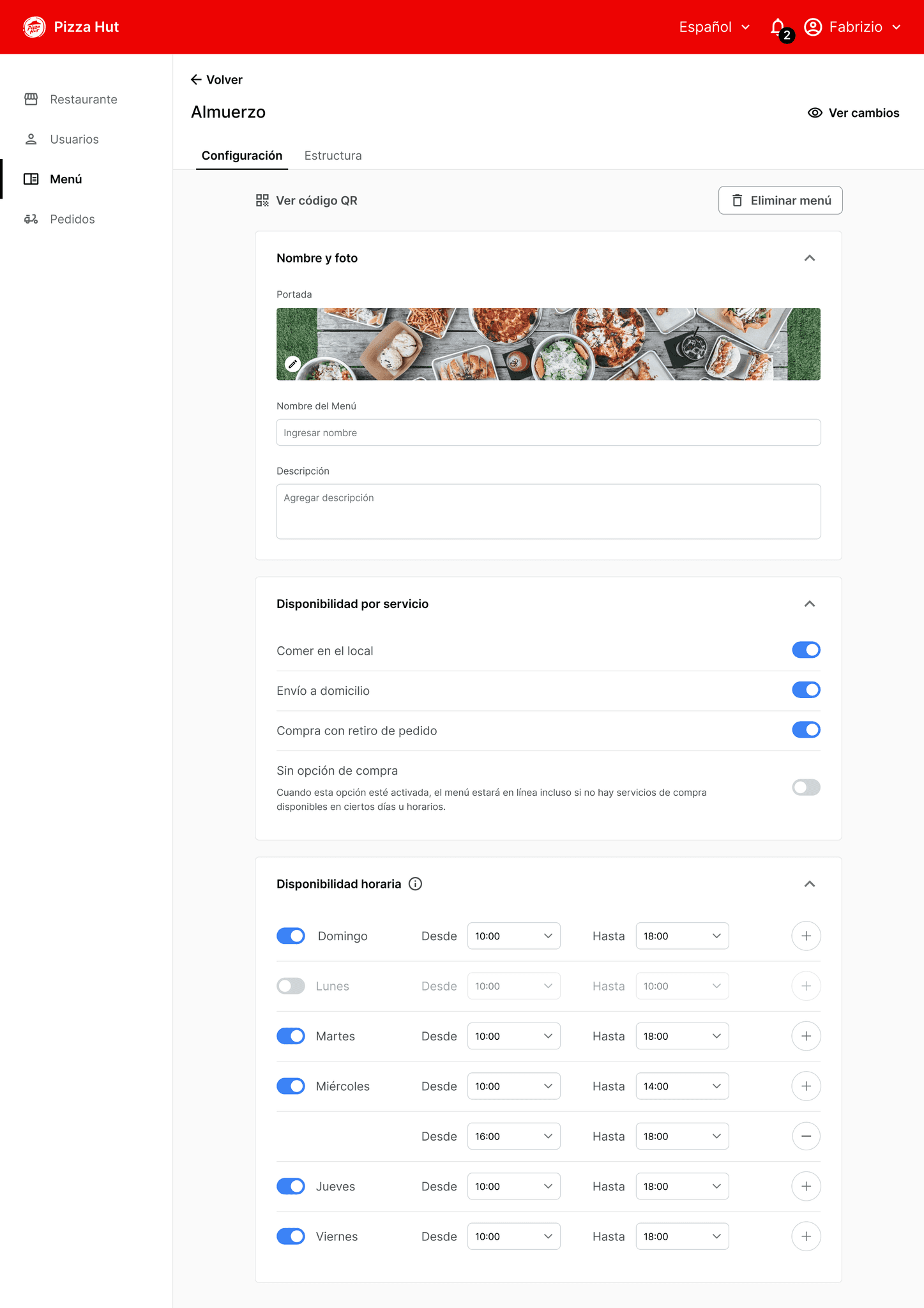
The solution: A step-by-step user flow that separates menu details setup from the arrangement phase, where categories, sections, and items are created and organized.
Our research showed that setting up initial details and constraints happened only once, while menu rearrangements were more frequent. Thus, I created a standalone arrangement view.
Additionally, I added two modules: "Set Up Availability by Service" and "Time," as these were essential configurations that admins needed to set up easily each time a menu was created.
1
2
4
3
1
Split menu config from structure arrangement flows
2
Related config steps grouped with unified cards and titles
3
Added missing config options: hours & service type
4
Frequent actions prioritized with clear CTAs
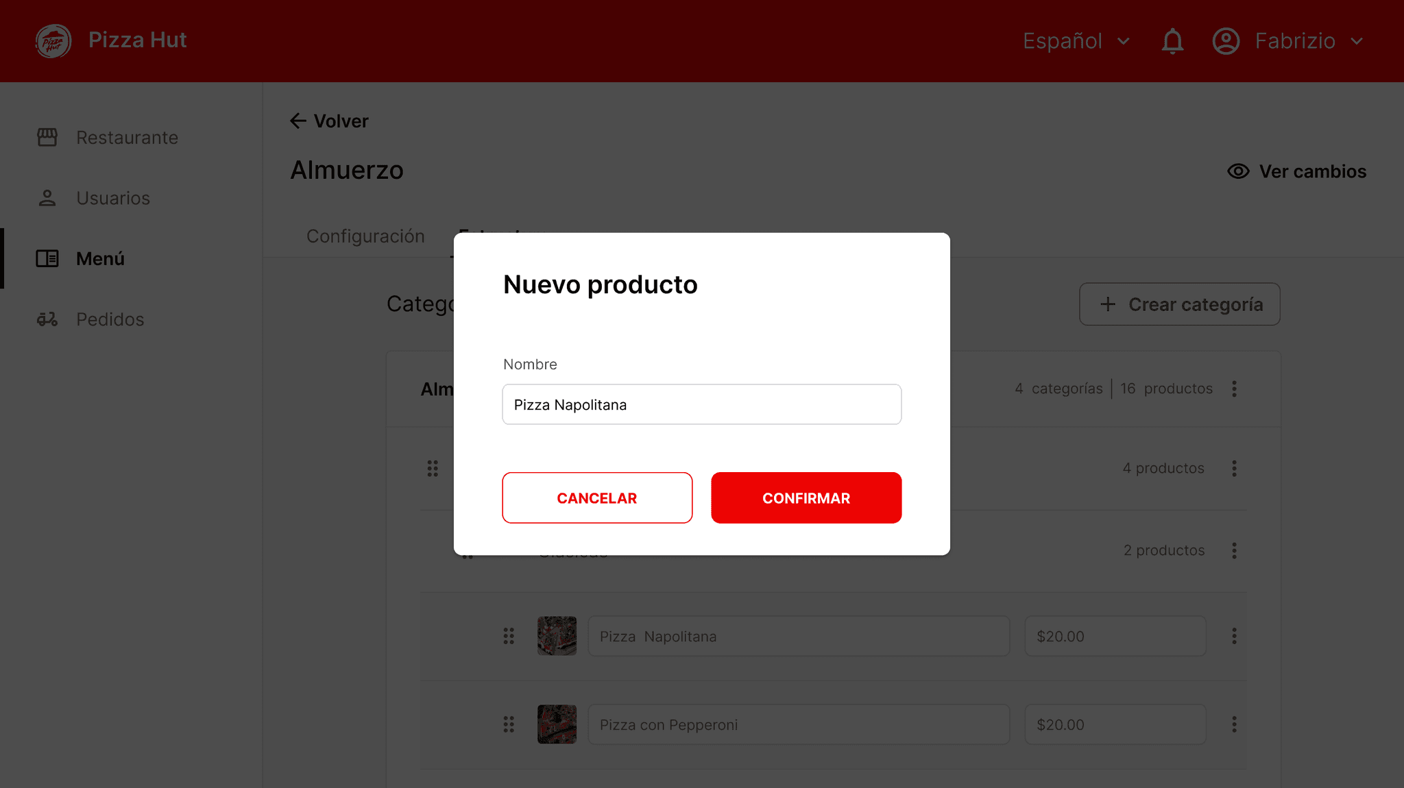
CHALLENGE 2
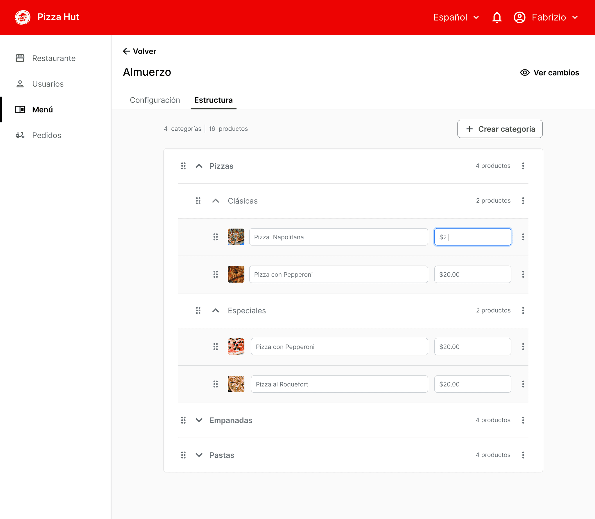
How might we make managing and rearranging menu categories, sections, and items more efficient?
The solution: a standalone arrangement view allowed admins to focus entirely on organizing the menu structure and iterating over time as needed.
I created a set of nested rows that could be collapsed and expanded as needed, with three main levels of hierarchy: Category, Section, and Items. Arrangement could be easily done through drag and drop at any level.
Titles and prices were the variables that changed most frequently, so I kept those upfront and left further editing functions on a second level.
1
3
4
5
6
2
1
Dedicated arrangement view separate from config
2
Quick access to customers portal to check updates
3
Expandable rows for easy menu navigation
4
Items in rows instead of cards for easy scanning
5
Editable photo, title, and price as key actions
6
Grouped secondary actions to reduce UI clutter
CHALLENGE 3
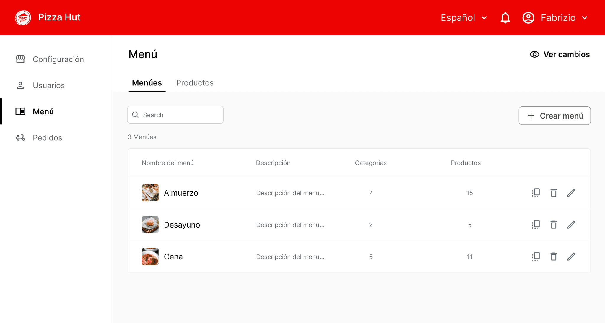
How might we streamline the process of managing items across various menus?
The solution: An items inventory list that is easily accessible from the main menu. Each new item created can later be assigned to multiple menus, eliminating the need to create the same items for different menus.

1
2
3
4
1
Dedicated Item library view for managing products list
2
Primary CTAs centered on main screen goal
3
Recycling menu section patterns to simplify development
4
Key item metadata in columns for easy scanning
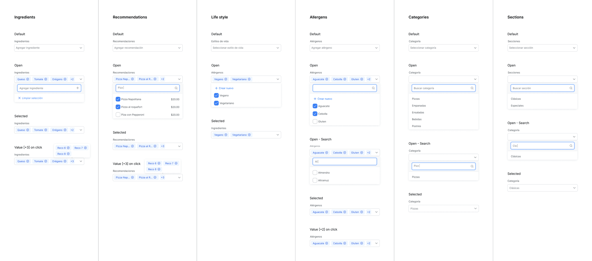
CHALLENGE 4
How might we simplify item creation and editing while allowing seamless menu management?
The solution: a sidebar for item creation and editing that allow working in parallel without disrupting the menu creation user flow.
Based on research findings, I divided the item creation flow into three main steps to address the needs identified:
General Setup: Define core item details such as name, images, description, and ingredients, as this was essential for establishing the item structure.
Item Variations: Manage size and price changes without creating a new item, reflecting the need for flexibility in item customization.
Add-Ons: Include modifiers to enhance or customize the core item selection, addressing the demand for additional customization options.


1
Item creation flow executed from arrangement view
2
Side menu for item creation to enable simultaneous tasks
Components behavior
FINAL RESULTS
The new interface reduced menu management time and effort significantly.
Support requests related to menu management issues virtually disappeared.
Both new and existing customers reported high satisfaction with the revamped back office.
KEY LEARNINGS
This project taught me to take full ownership of the design process for a complex platform with two user types—customers and restaurant admins—by effectively prioritizing and coordinating design backlogs for both front-end and back-office experiences.
It also sharpened my entrepreneurial skills, including client relationship building, budget planning, terms and agreements negotiation, time and risk management, and adaptability to unforeseen issues and scope changes.
SAAS - DATA PRIVACY
Optimizing setup flow for higher activation rate
E-COMMERCE
Enhancing Marketplace Conversion rate by 1.5x

E-COMMERCE
Streamlining Seller performance tracking with a centralized hub
Thanks for watching
Let's get in touch:
PORTFOLIO | LEAN MORERA | 2024